
Customizr Theme Options : Advanced options
The following documentation provides details about the customizer settings located in the Advanced options panel of the Customizr free and pro themes.
Additional CSS
For the beginner in particular, this is where the Additional CSS Panel comes into its own and provides a really powerful tool for applying CSS changes and seeing the effect immediately.
Just remember to click the Save & Publish button to keep your changes.
This is a really useful feature to test speculative CSS code before adding it to a Child Theme.

Further reading : guide to CSS and HTML in the Customizr theme.
Website Performances
When you have completed the customization tasks, the final consideration is how your site will perform on different devices. Customizr provides several useful aids:
- Improve your page speed by loading smaller images for mobile devices - The theme can allow the browsers to load smaller images for the theme's thumbnails depending on the viewport's width
- Performance : use the minified CSS stylesheets - The theme stylesheets can be presented in a minified state, ie with all whitespace removed and more optimised for performance
- Load images on scroll - Rather than loading all images before rendering a (scrolling) page, loading can be delayed until the image becomes visible

Front-end Icons (Font Awesome)
- Load Font Awesome resources - This option will allow you to control the loading of the Font Awesome resources (icon-set and stylesheet). It may come in handy if you use plugins that load the Font Awesome resources on their own, to avoid loading them twice.
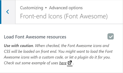
Further reading : example of use of Font Awesome icons
Mobile devices
- Automatically adapt the font size to the width of the devices (available only for the modern style) - Enabling this option will make your page font-size resize according to the viewport's width, e.g. to be better displayed in mobile devices

Theme style
Since Customizr 4.0 and Customizr-Pro 2.0 you have the ability to choose a design style for your theme: Classical or Modern (default).
While the Classical style is mostly based on a "flat design" approach with support for both modern and older devices and browsers, the Modern style is more inspired by a "material design" and it's implemented on top of one of the most recent web design technologies: the CSS flexbox.
